Pine shurb(讨论 | 贡献) |
Pine shurb(讨论 | 贡献) |
||
| 第180行: | 第180行: | ||
{{SVersion|1.8}} | {{SVersion|1.8}} | ||
[[File:Supply map nogui.png|300px|thumb|right|补给区域地图模式]] | [[File:Supply map nogui.png|300px|thumb|right|补给区域地图模式]] | ||
在补给区域地图上,展示了世界上的各个[[supply area|补给区域]]。就面积来说,一般补给区域比战区小,比单个省大。补给区往往由多个省组成。由国家及其盟友控制的补给区域中,驻扎了军队且没有超过[[supported supply|可供应补给]]上限的会显示为{{绿色 | 在补给区域地图上,展示了世界上的各个[[supply area|补给区域]]。就面积来说,一般补给区域比战区小,比单个省大。补给区往往由多个省组成。由国家及其盟友控制的补给区域中,驻扎了军队且没有超过[[supported supply|可供应补给]]上限的会显示为{{green| 绿色}}。补给区颜色为{{red| 红色}}表示不能为该区域内所有军队提供补给。没有军队,也即不需要补给的地区没有颜色。此外,海岸与邻国的补给区显示为{{blue| 蓝色}}。该模式下显示海洋贸易路线,同海军战略地图一样。 | ||
每块补给区域都有一个桶和箱子组成的图标[[File:Supply consumption.png|24px]],旁边有一段铁轨{{icon|Infrastructure}},如果是临海且有海军基地的话,还会有一个船锚{{icon|Naval base}}。每个图标旁都有相关的数字信息: | 每块补给区域都有一个桶和箱子组成的图标[[File:Supply consumption.png|24px]],旁边有一段铁轨{{icon|Infrastructure}},如果是临海且有海军基地的话,还会有一个船锚{{icon|Naval base}}。每个图标旁都有相关的数字信息: | ||
| 第186行: | 第186行: | ||
*图标 {{icon|Infrastructure}} 下方有一个数字,代表补给区域内所有地区的基础设施数量总和。 | *图标 {{icon|Infrastructure}} 下方有一个数字,代表补给区域内所有地区的基础设施数量总和。 | ||
** {{icon|Infrastructure}} 图标可以被点击,每次点击都会在建造界面为该补给区域内所有地区添加一个基础设施建造序列,当然每个地区基础设施总数不能超过10个。如果补给区域内有任何地区在建设基础设施,数字都会变为黄色并显示为"x/y"格式,其中"x"为建设完成后基础设施总数,"y"为当前基础设施总数。 | ** {{icon|Infrastructure}} 图标可以被点击,每次点击都会在建造界面为该补给区域内所有地区添加一个基础设施建造序列,当然每个地区基础设施总数不能超过10个。如果补给区域内有任何地区在建设基础设施,数字都会变为黄色并显示为"x/y"格式,其中"x"为建设完成后基础设施总数,"y"为当前基础设施总数。 | ||
** | ** 当鼠标在补给区域上方悬停时, {{icon|Infrastructure}} 图标上方会显示一个白色或{{red| 红色}} 的数字。该数字为此区域补给吞吐总量,大小为本区域平均基础设施水平的2.5 倍并向下取整( 如果某个区域即接收又运出补给,那么该数字就意味着[[Logistics#Incoming_supply| 陆运补给]] 的上限) 。如果这个数字是变{{red| 红色}} ,就意味着该补给区域是一个瓶颈。此时就要提升该区域内的基础设施来加强补给运输能力。 | ||
** | ** 注意,当补给区域临海且供给来自海外时( 也就是没有陆运可以提供供给的情况下) ,基础设施上方的数字是基础设施平均水平的2倍。 | ||
* | * 如果补给区域内有可用的海军基地 {{icon|Naval base}} ,该图标下会有一个数字用以表示该区域内海军基地的最高等级(与基础设施不同)。 | ||
**Clicking on the {{icon|Naval base}} will queue a single upgrade of the highest-level naval base in the supply area. If upgrades to the highest-level naval based are queued, this number will appear in yellow and be expressed in an "x/y" format where "x" is the final total level of that naval base, and "y" is the current level. | **Clicking on the {{icon|Naval base}} will queue a single upgrade of the highest-level naval base in the supply area. If upgrades to the highest-level naval based are queued, this number will appear in yellow and be expressed in an "x/y" format where "x" is the final total level of that naval base, and "y" is the current level. | ||
**When hovering the cursor over a supply area, the {{icon|Naval base}} will also have a number above it, appearing in either white or {{red|red}}. This number appears to reflect the amount of supply that can be received from or passed forward overseas through naval bases in the supply area, measured as three times the sum total level of ''all'' naval bases in the supply area (this is equivalent to performing the [[Logistics#Incoming_supply|overseas incoming supply]] calculation, while ignoring whether the originating naval base might be of a lower level). Similar to the infrastructure's top number, if this number is {{red|red}} it means it is bottlenecked, i.e., the supply area could potentially receive more incoming supply if the naval base or bases in the supply area are upgraded. | **When hovering the cursor over a supply area, the {{icon|Naval base}} will also have a number above it, appearing in either white or {{red|red}}. This number appears to reflect the amount of supply that can be received from or passed forward overseas through naval bases in the supply area, measured as three times the sum total level of ''all'' naval bases in the supply area (this is equivalent to performing the [[Logistics#Incoming_supply|overseas incoming supply]] calculation, while ignoring whether the originating naval base might be of a lower level). Similar to the infrastructure's top number, if this number is {{red|red}} it means it is bottlenecked, i.e., the supply area could potentially receive more incoming supply if the naval base or bases in the supply area are upgraded. | ||
2021年4月13日 (二) 10:07的版本
The map is where most tactical and strategic decisions happen. It also provides information related to these purposes, such as, weather, air combat, land combat, naval combat, and buildings.
Map divisions
|
|
这部分内容可能已不适合当前版本,最后更新于1.9。 |
The Map can be divided into four subdivisions:
- Provinces are the smallest subunit of the map, it is here that terrain, weather, capitals, land combat and victory points are handled.
- States are the next smallest subunit of the map, where construction, manpower, population, and country borders are decided.
- Supply areas are the next largest subunit of the map, here logistics and supply are handled.
- Strategic Regions are the largest of the subdivisions, and are where naval combat and air combat occur.
Map modes
Using different map modes, you can alter the information presented on the map. These map modes can be activated by either clicking on the appropriate button (icon) located in the lower right corner of the main screen or by pressing the associated hotkey.
默认地图模式
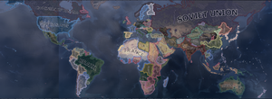
Shows sovereign nations and armies.
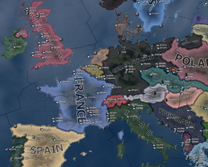
The default map mode is a combination of the political map mode and terrain map mode from previous games. It shows the name of all the nations, with their political color. Zoomed out, mainly the nation's color is seen, however, when zooming in, the terrain becomes more and more visible, integrating both map modes into one. Air fields, naval bases, capitals, and almost any other object on the map can be seen in this mode, represented by different symbols:
- Naval bases are anchors.
- Airfields are a top down picture of an airplane.
- Capitals are a star, which can be green if it is the nation's capital, gray if they are any other nation's capital, or red if they are the capital of any of the nation's enemies.
- Victory points are denoted by a small dot, which have a name when zoomed in, and particularly high value victory points are denoted by a slightly larger dot. They follow the color scheme of capitals.
- Units can be seen as counters or sprites on the map.
- Battles can be seen as pointers that are green if the nation is winning the battle, yellow if the battle is favoring neither side, or red if the nation is losing the battle, and it shows a number that summarizes how much the battle favors one side or the other.
- Naval combat can be seen along with navies and their missions.
- Aircraft can be seen flying where aircraft are in operation.
- Forts and any other state- or province-wide constructions are also visible.
- Demilitarized zones will be a red outline around any demilitarized area, such as the Rhineland.
|
|
这部分内容可能已不适合当前版本,最后更新于1.9。 |
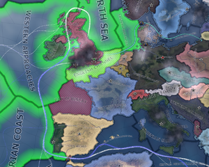
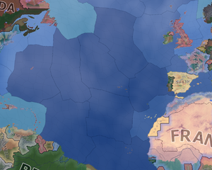
Shows strategic regions relevant to naval activity, with information on naval supremacy and naval tasks.
The naval map mode consists of the world's strategic regions, with a color scheme similar to the diplomacy for states on land under it. Convoy routes are also shown here with the following color scheme:
- Blue trade routes are resource transfers. These are imports, exports or resource transfers from owned oversea resources.
- White trade routes are supply transfers to oversea units.
- Green trade routes are lend lease routes.
Trade routes require convoys to operate.
Strategic regions that have sea provinces will be highlighted with green if they are under allied naval superiority. Provinces that are striped red are out of the fleets' operational range.
Straits
Canals or any type of controlled strait are shown on this map mode, and by hovering over them it is possible to see the access permissions your country has as well as the land provinces controlling the strait (blue outline). Straits are also shown on the Supply Map Mode and the Resource Map mode.
The following, are the names and province control points of the straits/canals on map and their respective permissions granted to nations (depending on the relations with the strait controllers).
| Name | Province Control | Unit Permissions | Contested? | Enemy | Friend | Neutral |
|---|---|---|---|---|---|---|
| Suez Canal | Cairo, Sinai | Armies | No | No | Yes | Yes |
| Navies | ||||||
| Submarines | ||||||
| Trade | ||||||
| Gibraltar Strait | Gibraltar, Spanish Africa | Armies | No | No | Yes | Yes |
| Navies | No | No | ||||
| Submarines | Yes | Yes | ||||
| Trade | No | No | ||||
| Bosphorus Strait | Istanbul | Armies | No | No | Yes | No |
| Navies | No | |||||
| Submarines | No | |||||
| Trade | Yes | |||||
| The Danish Belts | Sjaelland, Jutland | Armies | No | No | Yes | Yes |
| Navies | No | |||||
| Submarines | Yes | |||||
| Trade | No | |||||
| Kiel Canal | Schleswig-Holstein | Armies | No | No | Yes | No |
| Navies | No | |||||
| Submarines | No | |||||
| Trade | Yes | |||||
| The Panama Canal | Panama Canal (US occupied), Panama | Armies | No | No | Yes | No |
| Navies | No | |||||
| Submarines | No | |||||
| Trade | Yes |
Strategic air map mode
|
|
这部分内容可能已不适合当前版本,最后更新于1.9。 |
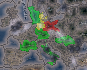
Shows strategic regions with information on aerial supremacy. It is automatically activated when an air base is selected.
The air map mode is, at first glance, merely a map of the strategic regions of the map. However, when at war, the regions can be highlighted with three colors:
- Red, which means the enemy has air superiority.
- Green, which means the nation or its allies has air superiority.
- Yellow, which means the air superiority is contested.
This map mode also shows all of the air missions currently set with the total number of planes assigned.
In the strategic air map mode ![]() more ground crews can be assigned, by clicking the icon in the desired strategic region. This gives a +10% bonus to mission efficiency in the strategic region.
more ground crews can be assigned, by clicking the icon in the desired strategic region. This gives a +10% bonus to mission efficiency in the strategic region.
补给区域地图模式
|
|
这部分内容可能已不适合当前版本,最后更新于1.8。 |
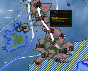
在补给区域地图上,展示了世界上的各个补给区域。就面积来说,一般补给区域比战区小,比单个省大。补给区往往由多个省组成。由国家及其盟友控制的补给区域中,驻扎了军队且没有超过可供应补给上限的会显示为绿色。补给区颜色为红色表示不能为该区域内所有军队提供补给。没有军队,也即不需要补给的地区没有颜色。此外,海岸与邻国的补给区显示为蓝色。该模式下显示海洋贸易路线,同海军战略地图一样。
每块补给区域都有一个桶和箱子组成的图标![]() ,旁边有一段铁轨
,旁边有一段铁轨![]() ,如果是临海且有海军基地的话,还会有一个船锚
,如果是临海且有海军基地的话,还会有一个船锚![]() 。每个图标旁都有相关的数字信息:
。每个图标旁都有相关的数字信息:
- 桶与箱子组成的图标
 上有一个数字,格式为0/114。第一个数字是友方军队和盟军使用的补给总量(数字为四舍五入的整数)。该总量为陆军、空军、海军所需补给的总和。第二个数字是补给上限。
 - 图标
 下方有一个数字,代表补给区域内所有地区的基础设施数量总和。
 图标可以被点击,每次点击都会在建造界面为该补给区域内所有地区添加一个基础设施建造序列,当然每个地区基础设施总数不能超过10个。如果补给区域内有任何地区在建设基础设施,数字都会变为黄色并显示为"x/y"格式,其中"x"为建设完成后基础设施总数,"y"为当前基础设施总数。
- 当鼠标在补给区域上方悬停时,
 图标上方会显示一个白色或红色的数字。该数字为此区域补给吞吐总量,大小为本区域平均基础设施水平的2.5倍并向下取整(如果某个区域即接收又运出补给,那么该数字就意味着陆运补给的上限)。如果这个数字是变红色,就意味着该补给区域是一个瓶颈。此时就要提升该区域内的基础设施来加强补给运输能力。
 - 注意,当补给区域临海且供给来自海外时(也就是没有陆运可以提供供给的情况下),基础设施上方的数字是基础设施平均水平的2倍。
- 如果补给区域内有可用的海军基地
 ,该图标下会有一个数字用以表示该区域内海军基地的最高等级(与基础设施不同)。
- Clicking on the
 will queue a single upgrade of the highest-level naval base in the supply area. If upgrades to the highest-level naval based are queued, this number will appear in yellow and be expressed in an "x/y" format where "x" is the final total level of that naval base, and "y" is the current level.
 - When hovering the cursor over a supply area, the
 will also have a number above it, appearing in either white or red. This number appears to reflect the amount of supply that can be received from or passed forward overseas through naval bases in the supply area, measured as three times the sum total level of all naval bases in the supply area (this is equivalent to performing the overseas incoming supply calculation, while ignoring whether the originating naval base might be of a lower level). Similar to the infrastructure's top number, if this number is red it means it is bottlenecked, i.e., the supply area could potentially receive more incoming supply if the naval base or bases in the supply area are upgraded.
- Clicking on the
- Note that hovering the cursor over a supply area will reveal an arrow showing the supply chain's path from the national capital to the area in question, and will reveal the infrastructure and naval base top numbers over each supply area in the chain. A red number indicates only the current bottleneck in the entire chain. Therefore, only one of the incoming supply paths in the area over which the cursor is hovering, either the infrastructure or naval base(s), can be currently bottlenecked. Accordingly, only one of these two numbers may appear red at any given time. If both numbers are white, there is no bottleneck in that supply area, but there may be a bottleneck elsewhere in the supply chain.
- A bottleneck in the capital supply area's infrastructure simply indicates that not all states in that area have infrastructure fully upgraded to level 10.
The calculations and consequences of these numbers are further detailed on the Logistics page.
Terrain map mode
|
|
这部分内容可能已不适合当前版本,最后更新于1.9。 |
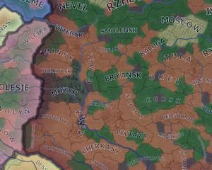
The terrain map mode shows the terrain of each region on the map using simplified colors. Land terrain has high adjusters for attack, defense and movement of land units. The terrain map mode can be useful to plan your offense or defense in for you favorable terrain.
Colors of the terrains:
- Plains: Brown
- Forest: Green
- Jungle: Green
- Marsh: Green/blue
- Hills: Light grayish with a bit yellow or green
- Mountain: Gray
- Urban: Dark Gray with road patterns
- Desert: Yellow
- Ocean: Blue
- Deep ocean: Dark blue
- Shallow sea: Light blue
- Fjords and archipelagos: Cyan
Resistance map mode
|
|
这部分内容可能已不适合当前版本,最后更新于1.9。 |
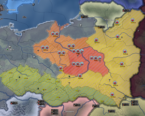
The resistance map mode shows resistance per state. Yellow indicates low, orange higher and red high resistance.
The percentage of resistance (0%-100%) is shown for each state. A green arrow downwards shows decreasing resistance, a red arrow upwards increasing resistance.
Also 3 resistance tiers are shown:
 Organized Resistance if the resistance is >25%
  Emboldened Resistance if the resistance is >50%
  Uprising if the resistance is >75%
Compliance map mode
|
|
这部分内容可能已不适合当前版本,最后更新于1.9。 |
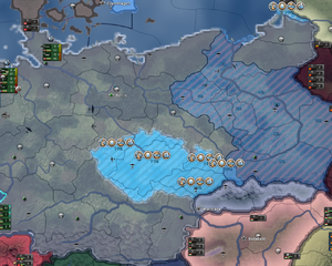
Shows compliance per state.
Lighter blue means more compliance.
The percentage of compliance (0%-100%) is shown for each state.
Also 5 compliance tiers are shown:
 Informants if the compliance is >15%
  Local Police Force if the compliance is >25%
  Reorganized Workforce if the compliance is >40%
  Volunteer Program if the compliance is >60%
  A New Regime if the compliance is >80%
Resource map mode
|
|
这部分内容可能已不适合当前版本,最后更新于1.9。 |
Shows resource locations and trade routes.
The resources map mode shows any convoy/ trade routes that are connected to the nation and canals/ straits across the world, similar to the naval map mode. However, this map mode looks like the default map mode when zoomed out, but when zoomed in, it shows a resource icon above any state that has a resource, along with the number of that resource produced in that province.
Diplomacy map mode
|
|
这部分内容可能已不适合当前版本,最后更新于1.9。 |
Shows diplomatic relations.
The diplomacy map mode shows its information through a multitude of colors.
- Green is the color that any land owned and controlled by the nation
- Light green is the color that any land occupied by the nation will be colored.
- Dark green is the color of any nation that has very good relations with the nation.
- Red is the color of any nations that the nation is currently at war with.
- Light red is the color of friendly territory that is occupied by enemies.
- Neon orange is the color of countries that the nation has wargoals against.
- Light orange is the color of any country the nation has very bad relations with.
- Blue is the color of any allied nations.
Factions map mode
|
|
这部分内容可能已不适合当前版本,最后更新于1.9。 |
The factions map mode shows the factions that exist around the world. The faction is colored the color of the leader nation, i.e. the Axis is grey due to the color of Germany, and it stretches across all nations in that faction.
States map mode
|
|
这部分内容可能已不适合当前版本,最后更新于1.9。 |
Shows states and population/ state category.
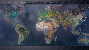
The states map mode shows an outline of every state in the world. These outlines are different colors based on the population of the state/ state category. This directly controls how many factories are allowed to be built in a state. The type of state can be found by simply hovering over it.
| 政策 | 意识形态 • 阵营 • 国策 • 内阁 • 政府 • 傀儡国 • 外交 • 全球紧张度 • 内战 • 占领区 • 情报机构 |
| 生产 | 贸易 • 生产 • 建设 • 装备 • 燃料 |
| 科研与科技 | 科研 • 步兵科技 • 辅助部队(支援连)科技 • 装甲车辆科技 • 火炮科技 • 陆军学说 • 海军科技 • 海军学说 • 空军科技 • 空军学说 • 工程学科技 • 工业科技 |
| 军事与战争 | 战争 • 陆军单位 • 陆战 • 编制设计 • Army planner • 集团军 • 指挥官 • 作战计划 • 战术 • 海军单位 • 海战 • 空军单位 • 空战 • 经验 • 损耗与事故 • 后勤 • 人力 • 核弹 |
| 地图 | 地图 • 省份 • 地形 • 气候 • 地区 |
| 事件与决议 | 事件 • 决议 |
hoi4de:Map hoi4es:Map hoi4fr:Map hoi4pl:Map hoi4pt:Map hoi4ru:Map


